


MOSTLY MOZART 2023
Event Branding
Mostly Mozart is an annual classical music festival held in New York City. I imagined that their objective this year was to expand reach to include younger people — milennials and Gen Z — as their core audience are the Gen X and Baby Boomer generations.
I developed the event theme and narrative, creating a cohesive storytelling framework. Design deliverables included a full visual identity system—logo, color, typography, and graphic treatments—along with wayfinding and signage, printed materials such as posters and brochures, and merchandise
Event Theme
To meet its objectives, the festival needed to evolve its programming to reflect modern tastes, anchored by a refreshed 2023 theme.
SNAP! is a thematic all about surprise and intrigue, featuring artists with hybrid styles who blend classical with other genres. This broadens the festival’s appeal to younger audiences as well as those with different musical preferences. Additionally, classical music usually sticks to traditional, established forms, over experimentation and new explorations, so having artists who do so will bring something unexpected of a classical-focused festival. The programming will feel fresh and unconventional—creating new experiences that reinforce the theme.

The Logo
The idea of connection and unification of differences was the main thing this festival really wanted to promote, so I explored logo concepts that could represent this in a visual way. I started with quick iterations. I explored a more abstract concept with how I could connect the letters “M” and “O”, while for others I thought about a more literal sense of unification, through arrows coming together, the intersection of different shapes, and more.


Take a look at the pitch deck below where I presented my three strongest logos.


The second design was chosen to be the event logo for Snap!
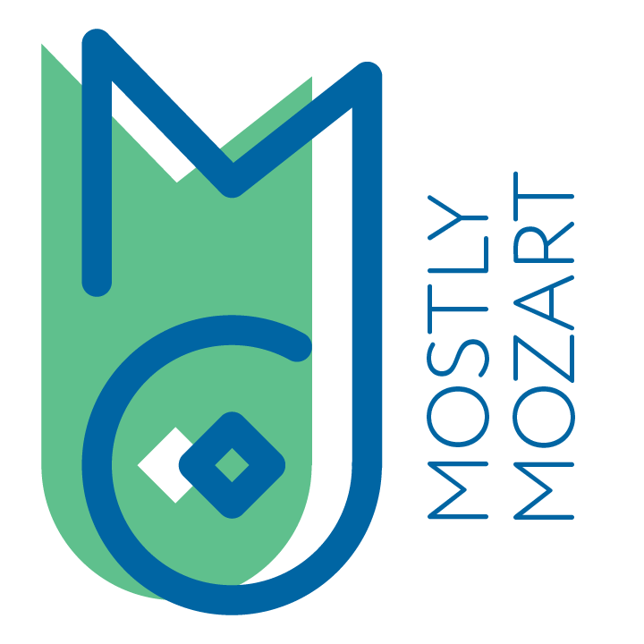
The icon is made up of the letters “M” and “O” that connect as one stroke, which references the idea of unification. A diamond shape instead of a circle for the O gives the logo a fresh feel.

When inspected more closely, a music note appears in how the M and the O connects. Additionally, “Mostly Mozart” is rotated and placed next to the icon. Both of these bring additional elements of surprise to this design.

Finally, the shadow behind the stroke brings movement, symbolizing the forward progression of Mostly Mozart in this year’s festival.


Project Information
The Logo
Final Deliverables
Brand Identity
Brand Identity


Color and Type
DIN 2014 is the typeface for SNAP! Its modern feel from the squared contours and tall x-heights of its characters fits the forward progression of the brand.
Rather than incorporating traditional and muted colors, which is the usual standard for classical music programs, a bright and colorful palette was introduced instead to do something different. Four shades from different sections of the color wheel showcase SNAP!’s aim to introduce diversity.

Image Treatment
Within this identity, hero imagery is treated with a blue overlay to create a duotone look. Additionally, focus subjects can be cut out and layered over each other to create a more dynamic look and feel.


These color swirls are the most important part of SNAP! They are the fun and playful elements that bring action and movement to the visual identity.

Interaction
The imagery and gradient swirls can be layered over each other as well. These two systems do not have to exist separately!
Final Deliverables
Project Information
Brand Identity
The Logo
Final Deliverables


Small-scale print collateral
A set of three promotional posters work when displayed individually as well as when placed together through how the swirls connect each separate piece.
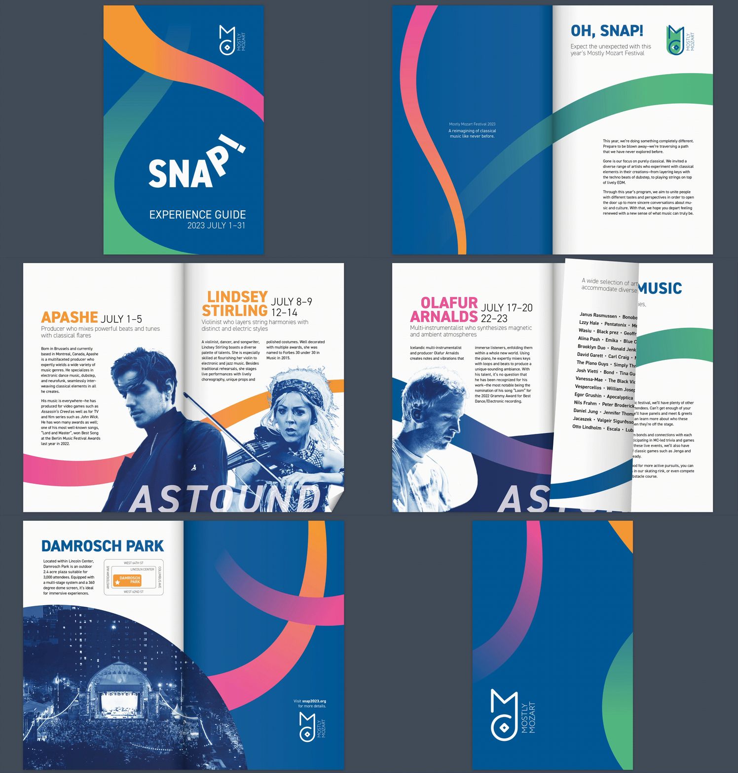
The event brochure includes more information about the headliners, the venue, and Snap!’s overall programming. Again, the swirls run across the spread to create movement as well as to connect content together.

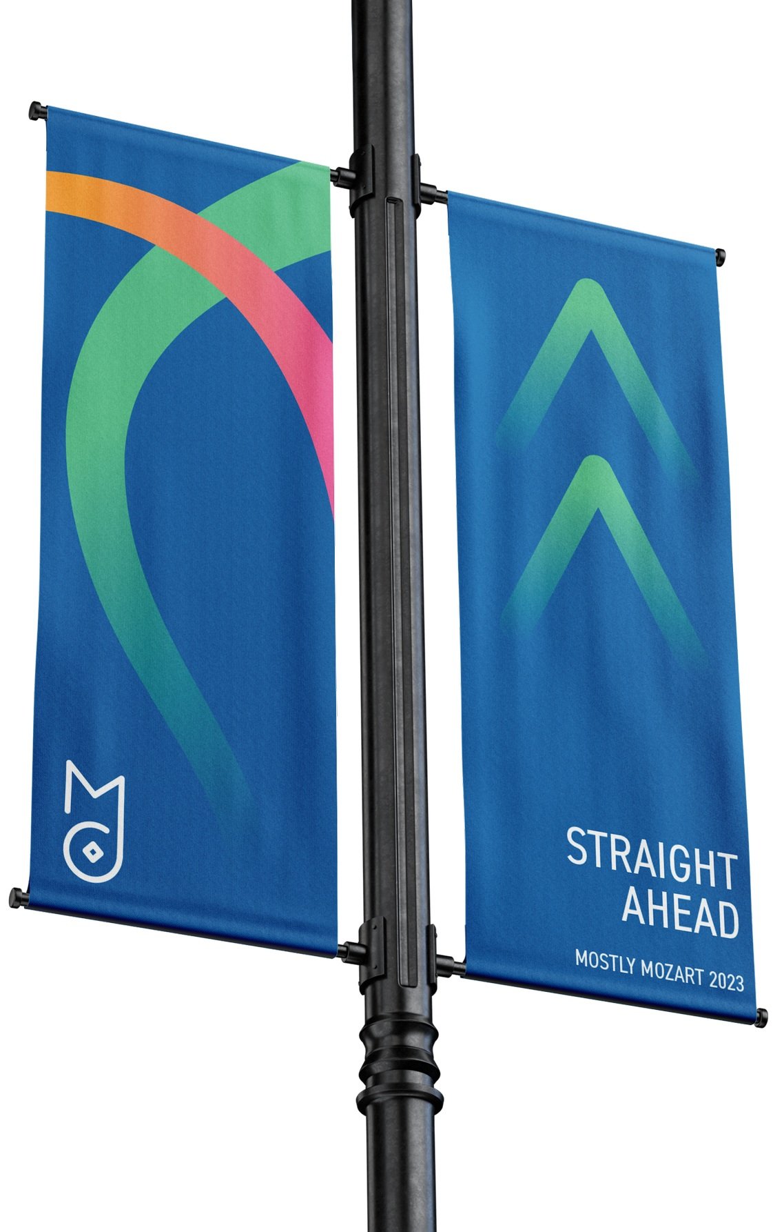

Wayfinding
Large hanging banners that show general direction, meterboards that include a more comprehensive guide to the space, and standing horizontal signage that display specific guidance are placed all throughout the venue to help attendees find their way!
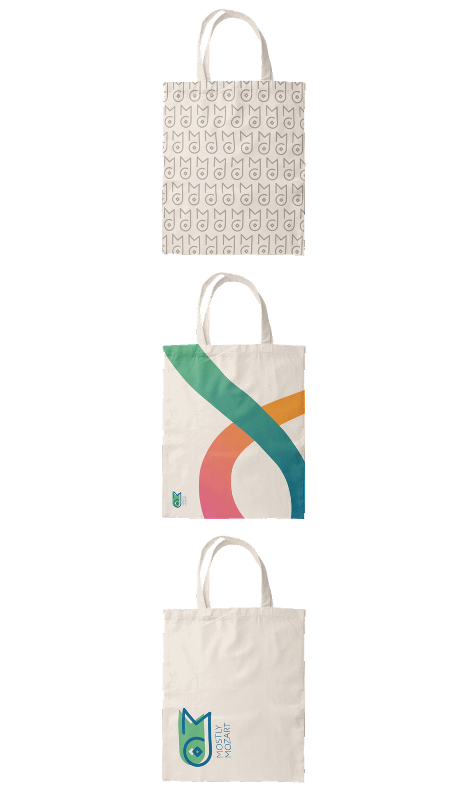


Merch
No event is complete without some merchandise! Tote bags, baseballs caps, and sunglasses explore different usage of the logo and swirls.