A unifying crowd experience
Building hype for the new season of a TV program
The brief
I worked on this project for an internship interview process! The brief was to design a live event or activation to hype up a new season launch of a TV show. While they asked for specific deliverables, such as an event logo and a promotional poster, I was allowed to select any TV show I wanted (fictional or real).
Caillou: Adulthood
I thought hard about what TV show I wanted to create my experience for. I decided to do it for Caillou: Adulthood, a fictional spinoff to the—real—series, Caillou.
The target audience for Caillou: Adulthood is Gen Z, as many of this generation grew up watching the original series: the show ran between 1997 and 2010. So, I thought it would be a strategic idea to base my experience off of nostalgia.
Another motif I kept in mind is the character’s baldness: Caillou is notorious for being bald, and many people love to poke fun at this part of the character in popular culture, so I wanted to make this a focal point of my experience as well.


Caillou Returns
Caillou Returns is the event I came up with! It’s a one of a kind experience that will definitely get crowds, both in live and virtual formats, excited for the new season of Caillou: Adulthood.
Attendees will gather together in Central Park to participate in guided activities and play fun games, take cool pictures at various photo opportunities, and meet the cast and crew behind the series. The event ends with an exciting broadcasted countdown to the trailer release, complete with a live trailer viewing!
I didn’t forget about those who cannot make it to the live event—everything will be live on an online stream as well.
Moodboard
Now that my idea was down, it was time to start thinking about the design direction. Thinking back to what I wanted to accomplish and include in this event (evoking childhood nostalgia and Caillou’s baldness), I looked at primary colors, basic primitive shapes, and playful, bouncy type to create a retro, 90s feel.

The visual identity
The logo focuses on the bald motif. The letters are also arranged playfully in order to call back to an older logo of the TV series and bring back elements of the past. I found that this also produces a childish feel.
In the same vein, the color palette is based on the dominant hues of Caillou—red, blue, and yellow. The event typeface is New Hero, which is easy to read but still fun and a little bit childish.
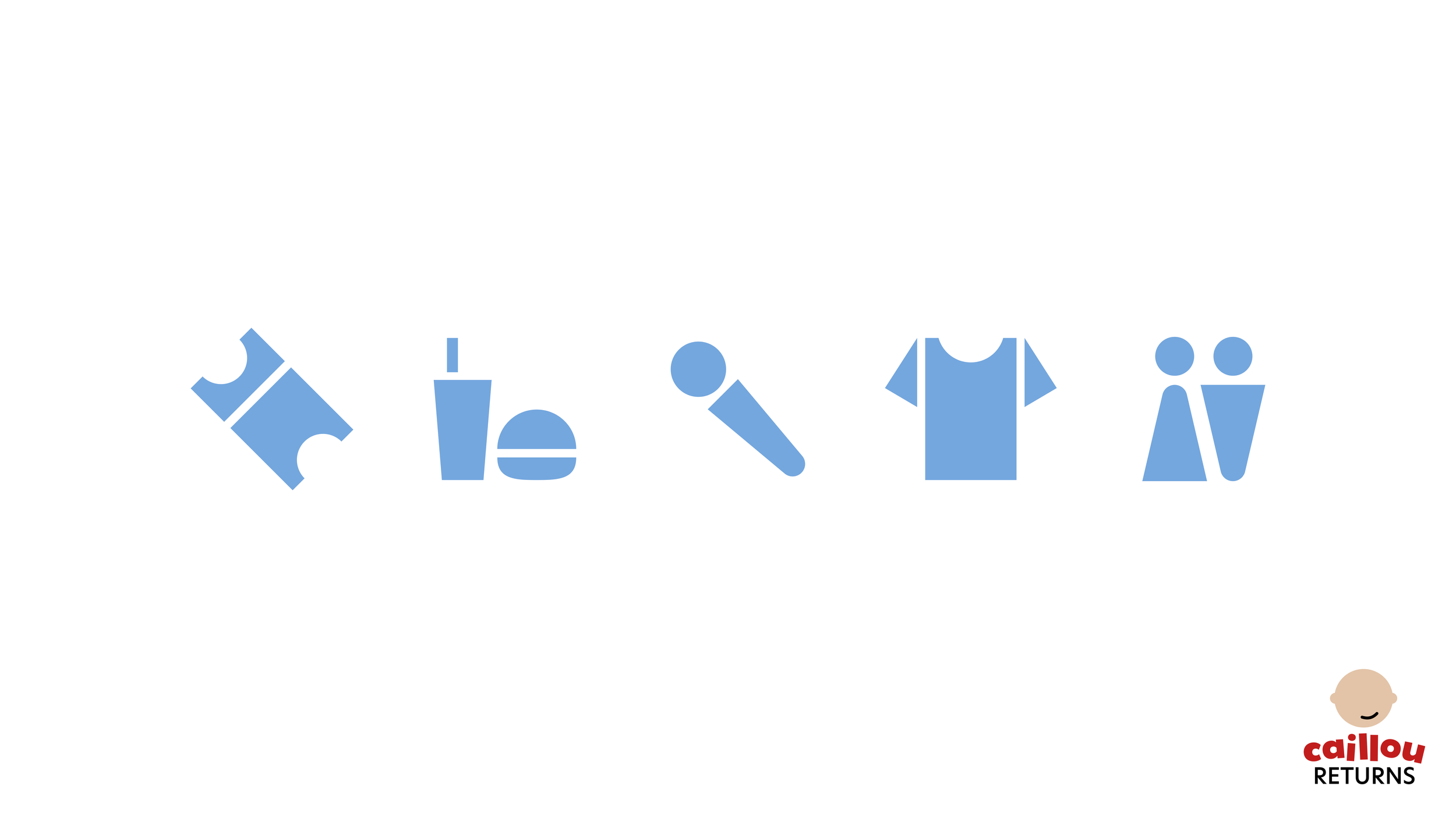
The graphic system consists of circles in different patterns, which calls back to the idea of a shiny and round bald head. Finally, I designed a few simple icons for wayfinding purposes at the live venue.


Promotion
An 11x17 flyer and a social media post were the first requested deliverables. Note the yellow background of the flyer that effectively catches the attention of passerby. I also included a QR code for easy access to the website so interested people can learn more about the event. I arranged the circle graphics differently to create diverse layouts, but it’s still clear that both promotional pieces are part of the same design system.
Flyer

Social media post
Wayfinding and directional signage
The next round of requests include deliverables for wayfinding. I designed a tall, standing sign that includes comprehensive directions to different sections of the venue. Including a tall piece of signage like this that towers over the crowd would be helpful in a busy space. On the other hand, the smaller A-frames would be great to place closer to their respective sections.
Razor flags can also be interspersed throughout the location, but they serve their greatest purpose at the entrance. It would be an effective way to get attendees to start feeling united and together as they enter the venue, especially because that’s a big symbolic aspect of flags.

A-frame signs


Tall standing sign


Razor flags
Merch and freebies
These were a few fun extra items I prepared for the pitch! I included a simple baseball cap as a piece of merch, and a face mask and hand clapper as freebies that all attendees would receive. I thought that these freebies would be a great way to promote a sense of positive mob mentality. Giving attendees interactive products that they can put on or use throughout the event, rather than items that they’d just put in their bags and end up forgetting about, can help them feel like they are a part of this bigger collective. The hand clappers especially are also very nostalgic, since they are toys that Gen z grew up with.


Photo opportunity
2022’s campaign focused on promoting safe spaces in online communities. With that in mind, I wanted to create a design related to social technology. I ended up with a hand and phone graphic as the dominant feature of the booklet cover.
Since teal is the main color of SAAM, I settled on yellow as a secondary color that wold provide good contrast but also mesh well with the blue-green hue. And, here and there throughout the booklet, I made sure to add the ribbon symbol of this campaign.Finally, I added translucent spotted circles to add more interest to the solid teal backgrounds.


Relative sizing of all assets
Countdown graphic
One final extra asset I prepared for the pitch was a countdown graphic that would be displayed on the stage screen to count down the time to the trailer release. This would actually be a dynamic motion graphic, with the circles moving into, out of, and around the screen, as well as changing colors and patterns, and appearing and disappearing.


As mentioned before, there will be a digital livestream of this event for those who cannot make it in person! The stream would live on the PBS website.
Digital livestream

Final thoughts
I had very little time to prepare this pitch—less than a week, from receiving the initial brief to submitting the final deck. And, I received the assignment during Halloween weekend, which is always filled with lots of activities, so I was even busier! However, it was beneficial for me to experience this fast turnaround period, because in the real world and especially in agency work, there’ll be projects and tasks with incredibly tight deadlines. I was glad I was able to perform under pressure and end up with work that I was proud of, which helped me confidently present my material during the pitch meeting.
Feel free to click through the deck I presented right below!